Creating Meaning with Images
Elements of Art
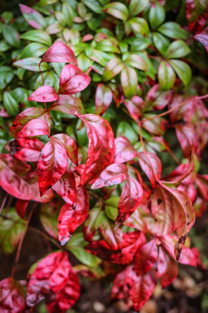
COLOR
This image of a bush in my front yard uses the element of color, in particular complementary colors. The leaves in the foreground are red and their opposite color, green, is filling in the background. Some leaves even fade from red to green. The two colors really stand out next to each other with the warm red color coming forward and the cool green receding.

TEXTURE
The rocks on my chimney were the subject of this photograph. I like how they show the hard, rough texture of the stone and in-between the stones there are little lines of sandy mortar. All the stones also have variations in tones of neutral colors to make the photograph more interesting than one solid color.
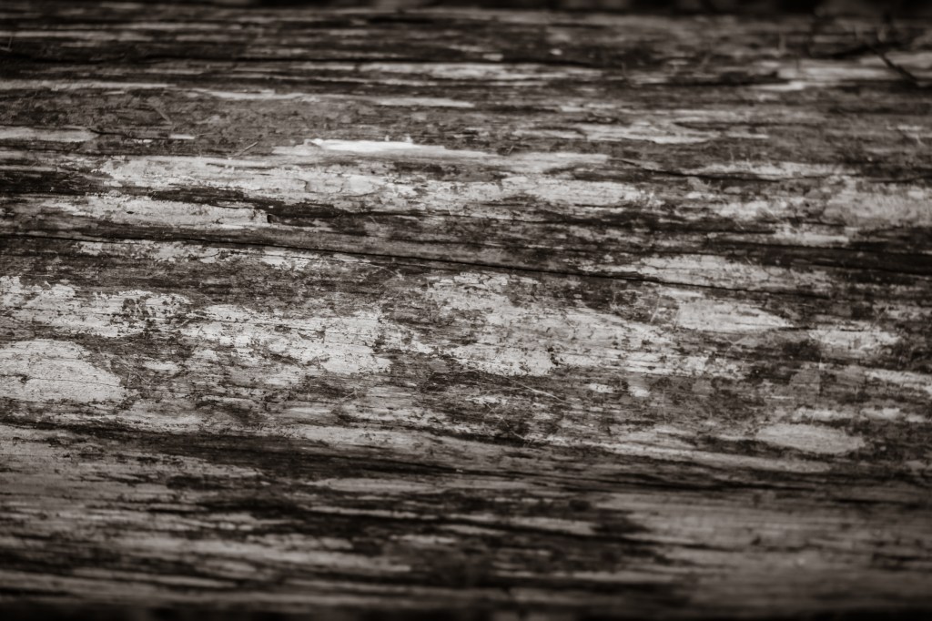
VALUE
I went for a walk in the woods behind my house for this photo shoot and came upon this log in the forest. The bark was peeled off and underneath there were different values of light, medium, and dark wood. I used a close-up lens to better capture the roughness of the wood. I edited the photo to black and white to bring out the variation in values.
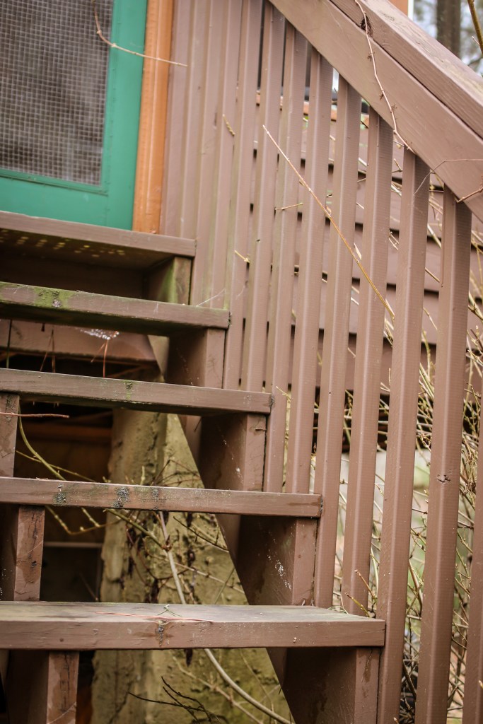
LINES
These vertical and horizontal lines on the steps of my back porch captured my attention as I walked around the yard. The repetition of lines in the same direction and same color gives them weight and balances out the photo. I also like how a zigzag is made on the right side of the steps where the vertical and horizontal lines come together.
Principles of Design
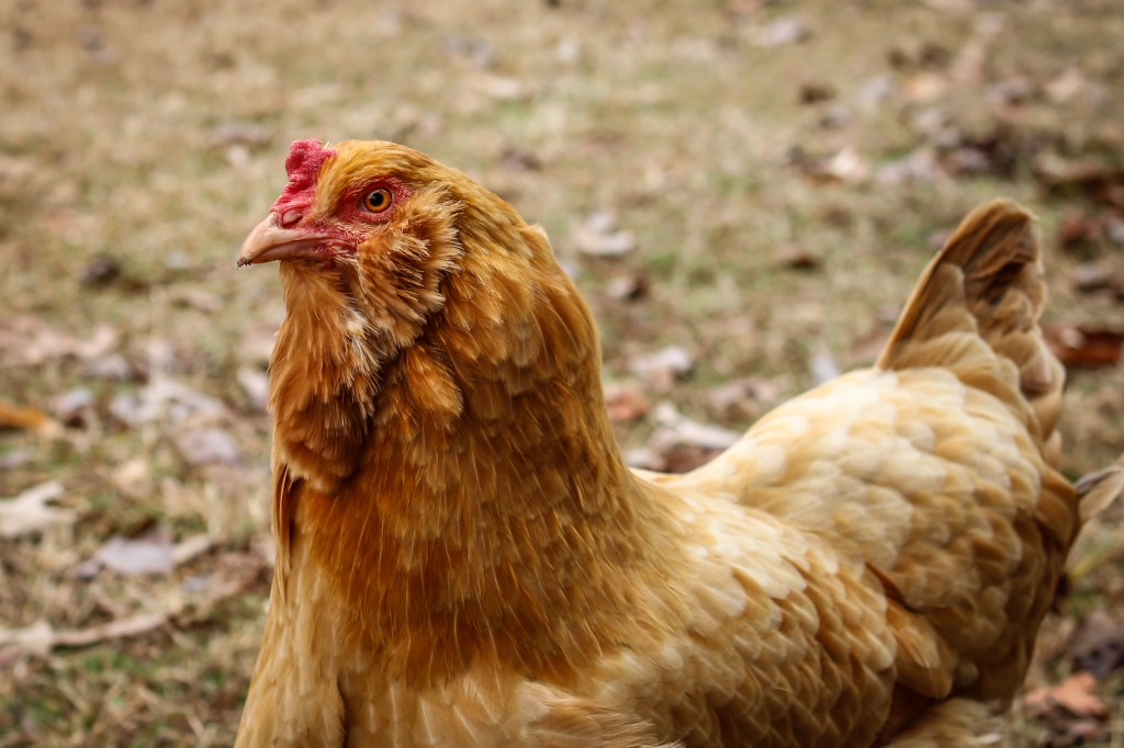
FOCAL POINT / EMPHASIS
This is one of our chickens. Her name is Peep. She is a great model and will occasionally stand still long enough for me to get a photo of her. This photo shows the principle of emphasis because I focused my lens on her face by using an aperture with a low f-stop like f 3. This made the foreground of her face in focus and the background blurry to put all of the emphasis on her face. I also cropped the image to make sure the image used the Rule of Thirds by putting her face off-center and creating a more dynamic compostion.
RHYTHM / PATTERN
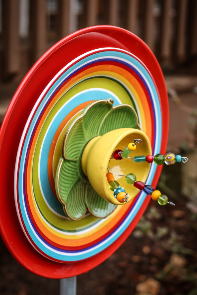
In this image I portrayed the principle of pattern. This is a plate flower. My Mom makes these by finding dishes from thrift stores and drilling through them, putting them on a pole, and adding a little wire and beads. We display this in our yard along with some other plate flowers. The plate with lines on it has a pattern that creates radial symmetry around the plate.
CONTRAST
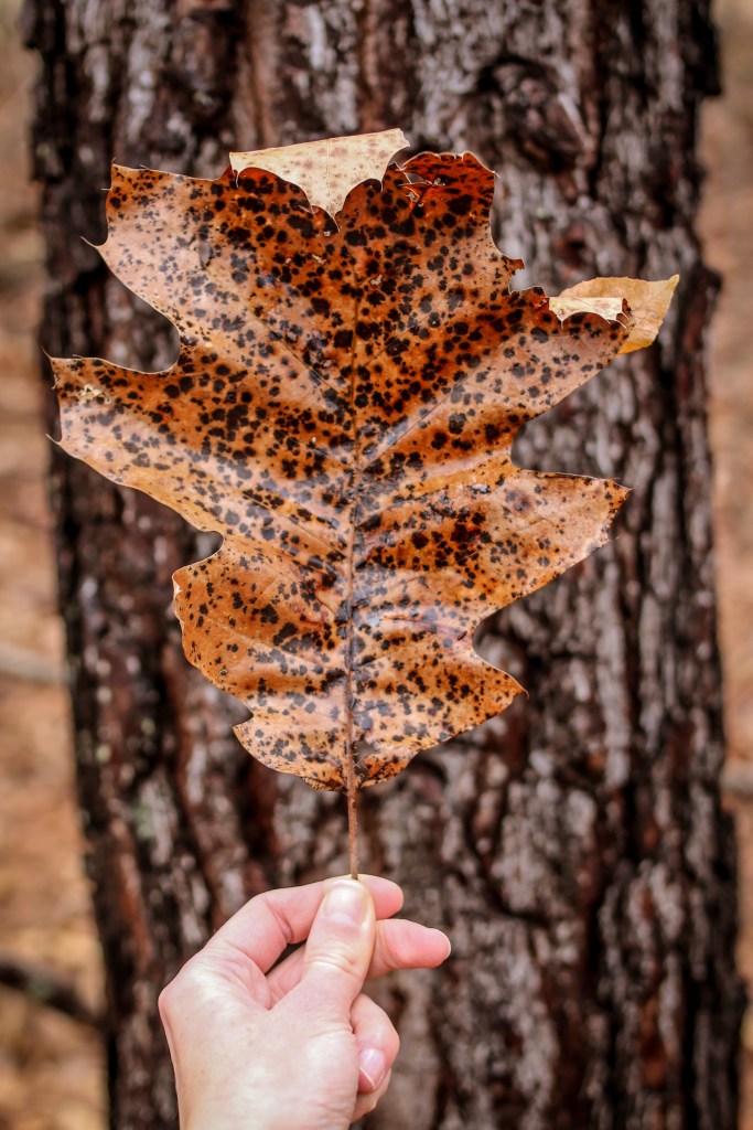
On a walk through the woods, I picked up this huge, spotted leaf. I tried to photograph it on the ground, but it was the same color as the other leaves around it. I picked it up and put it in front of this dark tree to create contrast between the lighter brown of the leaf and dark bark so the leaf’s edges could stand out better.
UNITY
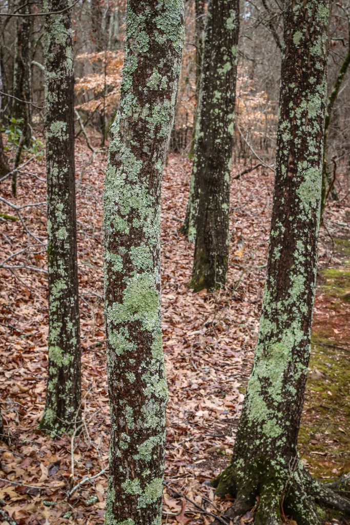
To me, these trees create a sense of unity. They bring together several elements of art and principles of design to create an image that is harmonious. The trees create a repetition of vertical lines. The bark has a contrast between light and dark values. The trees are equally spaced, giving them balance and equal weight in the photo. Finally, the repeated leaves on the ground create a pattern in the background of the trees.
Combinations of Elements of Art & Principles of Design
COLOR, TEXTURE, & FOCAL POINT
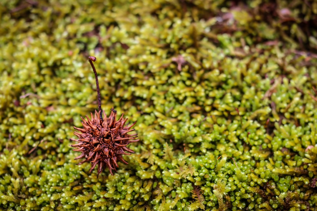
This bright green moss caught my eye in the woods. I used it as a textured and colorful background for a sweet gum ball. The different colors really stand out and emphasize the textures. I used the Rule of Thirds when positioning the sweet gum ball to create a dynamic focal point.
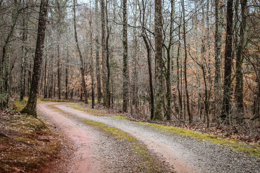
LINES & RHYTHM / PATTERN
There is a driveway behind my house that curves into the woods. It made a beautiful set of S-shaped lines on the road with lines of moss in-between the gravel. The black trees create a rhythm or pattern of vertical lines in the top half of the photograph.
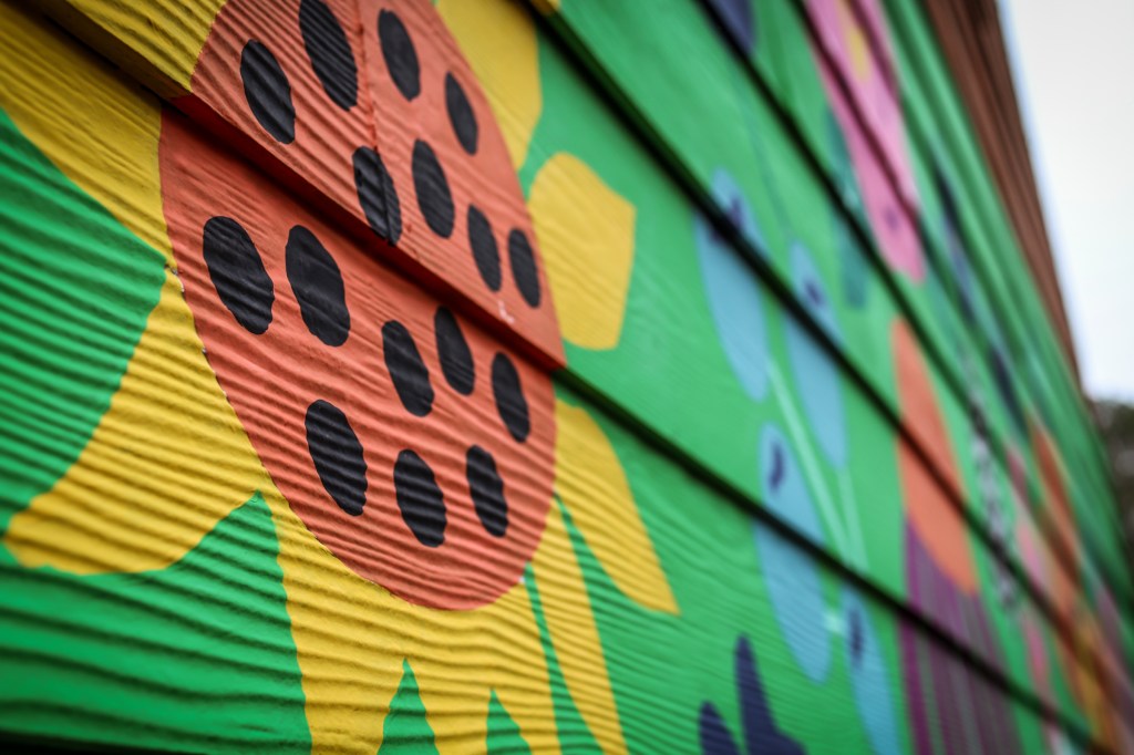
COLOR, LINES, & FOCAL POINT
I painted a mural of flowers on the side of my art studio this summer. This photograph has a sunflower as the focal point while the rest of the mural is blurry as it recedes. The lines on the wood siding are creating diagonals that come together in the distance. The colors in the mural are bright and make the image pop.

VALUE & FOCAL POINT
It rained today. The puddles on the ground created a perfect spot to reflect a tree that was overhead, making a focal point for the picture. I edited the photo to make it black and white. This helped the tones of gray and black stand out in the photo, making it moodier.
Laws of Gestalt Theory

PROXIMITY
In my art studio, I arranged some scraps of painted paper in tones of yellow-green. The shapes are arranged closely which makes them look like they are in the same group. The similar color and spacing around the shapes also helps it look like the items are grouped by proximity.
SIMILARITY
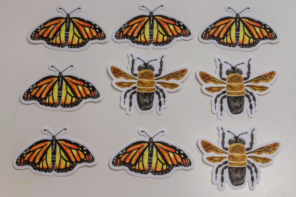
I am a watercolor artist that paints pictures of nature. I also print my paintings on stickers. These are some of the stickers of butterflies and bees that I created. By grouping them in rows by similar type, it is easy to see which stickers are in which group.

CONTINUITY
I arranged these paintbrushes in a row. After the row of brushes ends, I painted some watercolor lines in a similar thickness, direction, and colors so it gives the appearance that the line of brushes is continuing into the distance even though it is a not the same set of objects. Our brains are continuing the pattern for us.

CLOSURE
In my art studio when I paint something that I don’t like I cut it up into scraps to collage into cards or paintings later. I used these warm colored paper scraps to create a heart. The paper scraps are the postive space and the white table is the negative space. Even though I didn’t really cut out a heart for this picture, our brains interpret the negative space as a heart by closing in the space in the image.
Reflection
I really enjoyed this assignment. I am a photographer, art teacher, and artist. I am very familiar with the elements of art and principles of design because I teach those to my students in my art classroom. I had never heard of the Four Laws of Gestalt Theory before though. I had a harder time finding things to photograph of those in nature so I decided to create the Gestalt Theory photographs in my art studio with materials I found there that could be easily manipulated instead.
I originally thought I would not be able to take many good photos in my backyard because it was a cold and dreary January day. Normally I like to take pictures outside when the grass is green and the plants are blooming, but I was able to find more inspiration than I thought just by wandering around and having an open mind to the possibilities.
I could use what I learned from this assignment in my classroom in the Photography Club that I teach to fifth graders. I could create a photo shoot assignment for them where they have to take pictures of the elements of art or principles of design on our playground or in my classroom using art supplies. I think they would really like that and it could help review the elements and principles for them.
